I’m sure that you know what brand is referred to in this post by the featured imagine above this post. I won’t mention any specific name, but feel free to look up the name and logo on their website. It’s quite sad, really, but I have enough pictures of various interpretations of this brand logo/name to put together a little top ten ranging from sorry to ridiculous. The Chinese seem pretty oblivious, or they just adapt their usual ignore-all-attitude.
Several attempts at lawsuit seem to only encourage more and more copycats emerging from their hiding spot. Pictures were taken in Guangzhou, Kunming and Shanghai, and some are big shops on major shopping streets, and some tiny holes in the wall, ready to disappear.
So most name thieves agree that there needs to be a name with a N and a B, and the logo needs to be a capital N with various adorning elements. What is open to interpretation is the origin of the brand (US, England, China, Hong Kong…) and if the first word is supposed to be new, niu or xin (the Chinese word for new). Use of capital letters is also a hit or miss…
But here we go:
10 – the original
warm-up round goes to the real company, which is neither photographed nor mentioned with their real name. But they do deserve some credit.
9 – USA XIN BAI LUN LIMITED
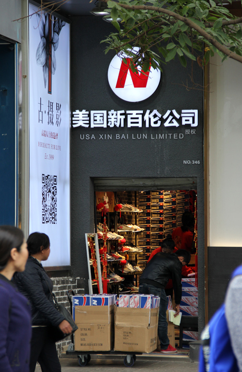
USA XIN (=new) BAI LUN
At least the country of origin is correct. This store uses the Chinese word for new and the common Pinyin interpretation of BAI LUN. The logo is a white circle with an N slightly tilted towards the right.
8 – NEWBAILUNLP
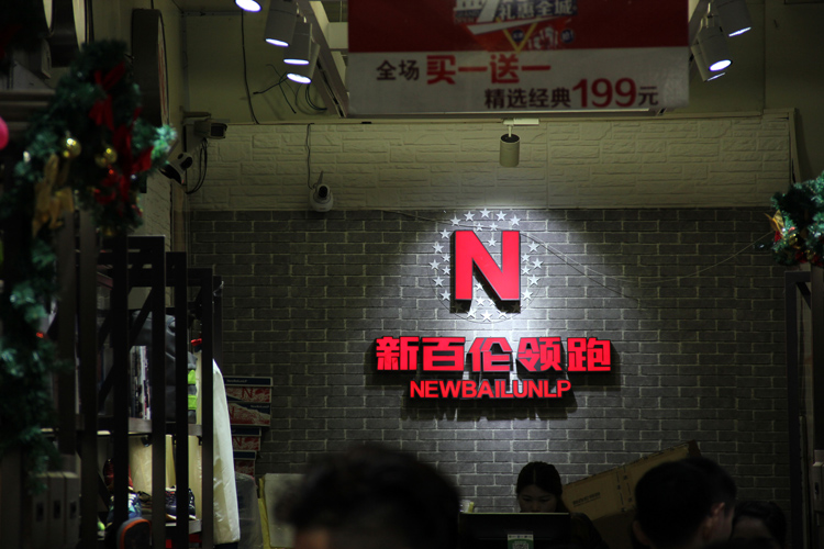
NEWBAILUNLP
Can someone please enlighten me as to what LP means. 领跑 = ling pao = LP = taking the lead. But why? Anyways this logo is straight with stars in the background. Not that creative.
7 – England Niu Bai Lun
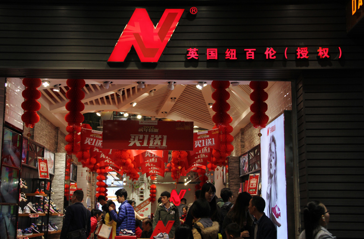
Niu Bai Lun England
This store seems to be from England but with the first word being Niu. I think all possibilities with the Bai Lun title are taken now. Logo is red, tilted, but thicker in the middle. Buy one get one free sale!
6 – NEW BARLUN
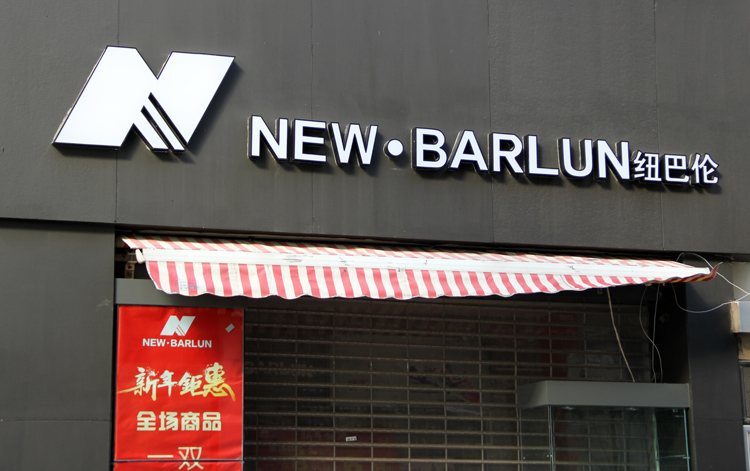
NEW BARLUN – Niu Ba Lun in Chinese
Moving away from Bai Lun, we come up next with Barlun or ba lun in Chinese pinyin. The first part remains the niu character. Logo is white with stripes – is that a play on that sports company with the three stripes?
5 – New bunren
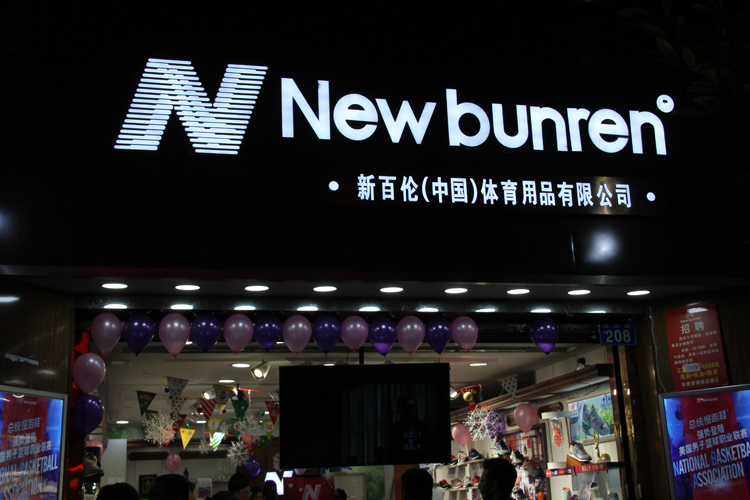
New bunrun – Xin Bai Lun China in the subtitles
Moving on to the homeland, this store here bases itself in China. The Chinese name says xin bai lun but the English name gets changed to bunren. Whatever that means. The logo has some king of swirl in the middle of the N.
4 – New baillon
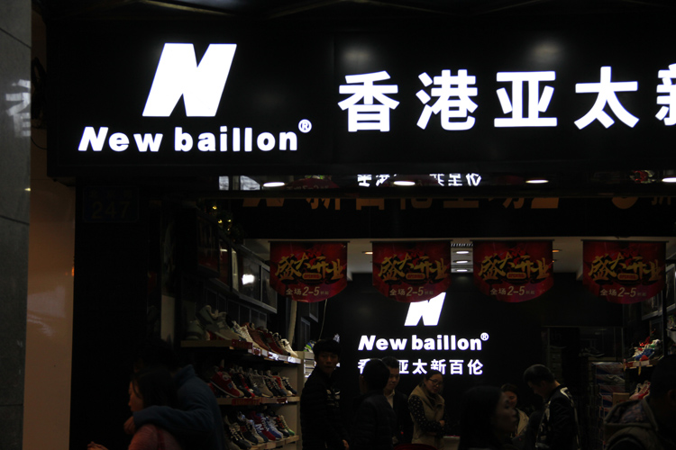
New baillon – from Hong Kong
Ah so this one is from Hong Kong. The Chinese name is also xin bai lun but please call them New baillon in English. It’s not the same company, clearly. The N is white and thicker at the top and bottom of the letter, so maybe the opposite of the England Niu Bai Lun one…
3 – new bailone
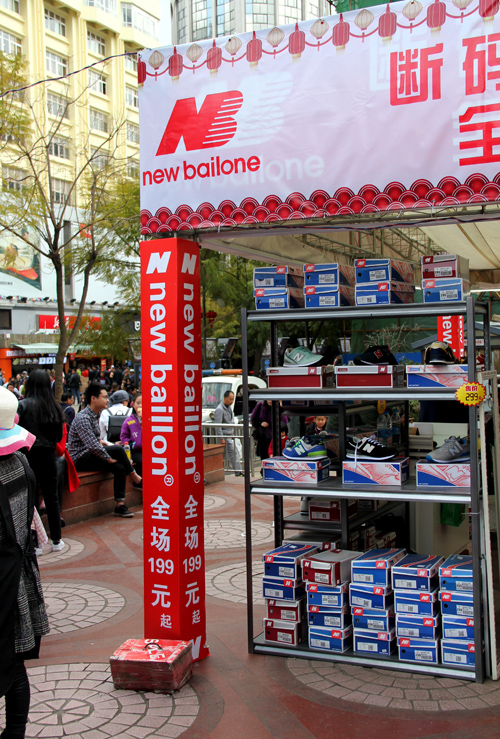
New bailone – note the column with new baillon below
Now we are navigating the waters towards ridiculous-land. new bailone. Classy. If you look up the original logo you will find that they put the stripes on the wrong letter. And I mean that column underneath is just the icing on the cake.
2- Niupolun
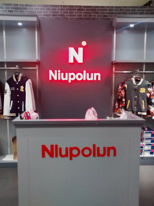
Niupolun
The close second. Oh so here is one breaking the tradition of NB and instead going for NP! How daring! Especially when they mix up I and L in the lettering on the counter and the u is facing the wrong way. Newbie mistakes.
1 – new bylenera
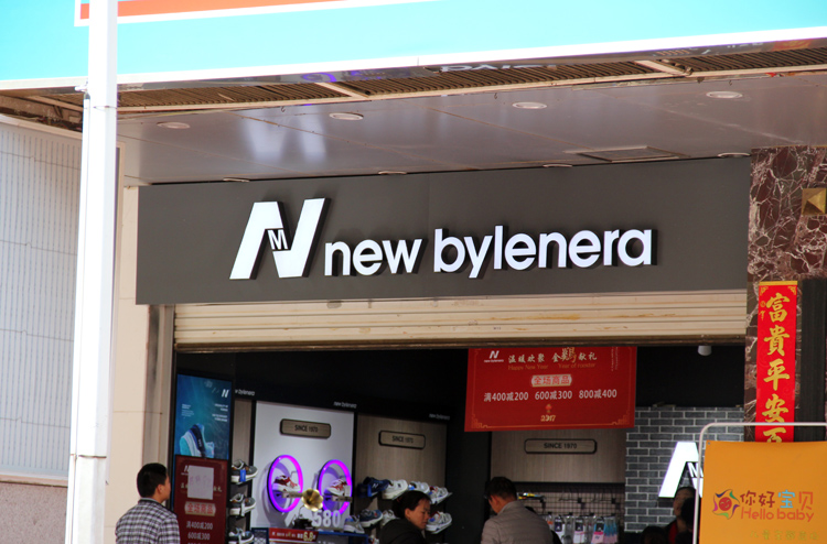
new bylenera
The unrivaled winner of this competition. Just WTF I mean WTF. I mean is that anything close to the actual name? Or maybe that is the point, no lawsuit possible because it is just too far of a stretch. And the M in the logo? What is it doing there? I am quite confused now..
January/February 2017